The debt snowball in numbers
Systemic risk Crises Policy
In The next crisis I use the government debt identity to see where today's worries end up. This post has the numbers behind it, for 11 countries.
The government debt-to-GDP ratio evolves according to
$$ \Delta d_t \approx (r_t - g_t) d_{t-1} - pb_t + \text{other}_t $$
where \(d_t\) is the debt ratio, \(r_t\) the effective real interest rate on the debt, \(g_t\) real GDP growth and \(pb_t\) the primary balance, revenues minus non-interest spending, relative to GDP. Interest makes the debt ratio grow, while growth and primary surpluses shrink it. The last term, \(\text{other}_t\) , which the European Commission calls the stock-flow adjustment, is what changes the debt without passing through the deficit, such as government lending, asset sales or spending recorded in one year and borrowed for in another.
The term \((r_t - g_t) d_{t-1}\) is the snowball, how much the debt ratio grows by itself.
The identity is in real terms, and the numbers below are nominal, like the 5% in the bond market. With consistent definitions the two give the same debt dynamics. Inflation lowers the real cost of the existing debt, and in the nominal numbers that shows up as faster growth of nominal GDP.
Conventions
The tables follow the layout and the signs of the European Commission's debt tables.1 All figures are for 2025 and in per cent of GDP, except the interest rates and the yields.
The change in the debt ratio is minus the primary balance, plus the snowball effect, plus the stock-flow adjustment. A negative primary balance is a deficit, and it raises the debt ratio. A positive snowball effect or stock-flow adjustment raises it too.
The snowball effect is interest expenditure, which is positive, plus the effects of real growth and of inflation, which are negative when the economy grows and prices rise. Those are contributions to the change in the debt ratio, not rates of growth or inflation. Inflation is the GDP deflator, and interest rates and growth are nominal.
What raises the debt ratio is in red and what lowers it is in green. Rows may not add up because of rounding.
Today
So what do the numbers look like today? The first table shows debt relative to GDP in 2025 and how it changed over the year.
| Gross debt ratio | Change in the ratio (−1+2+3) | (1) Primary balance | (2) Snowball effect | (3) Stock-flow adjustment | |
|---|---|---|---|---|---|
| United States | 123.9% | 1.6% | −2.9% | −1.9% | 0.6% |
| United Kingdom | 102.3% | 2.4% | −2.1% | −1.6% | 1.9% |
| France | 115.6% | 2.9% | −2.9% | 0.0% | 0.1% |
| Italy | 137.1% | 2.4% | 0.8% | 0.5% | 2.6% |
| Germany | 63.5% | 1.3% | −1.6% | −0.9% | 0.6% |
| Spain | 100.7% | −1.0% | 0.0% | −3.2% | 2.2% |
| Netherlands | 44.4% | 0.6% | −0.9% | −1.4% | 1.2% |
| Greece | 146.1% | −8.0% | 4.9% | −4.1% | 0.9% |
| Japan | 206.5% | −8.0% | 0.3% | −8.2% | 0.5% |
| Iceland* | 56.1% | −4.3% | 0.2% | −1.7% | −2.5% |
| South Africa* | 78.6% | 2.7% | −0.3% | 2.6% | −0.2% |
* Iceland and South Africa use net interest, so their primary balance and snowball effect are not on the same basis as the other rows. Japan's debt is on the IMF's revised basis, consolidated and at face value, which is why it is lower than the 235% or so quoted until last year.
For now, the snowball works for most of the governments.
Most rich countries still pay a nominal interest rate of about 3.5% or less on their debt. That is well below what the market asks now, and in most cases less than nominal GDP grows.
In the US and the UK the snowball takes between 1% and 2% of GDP a year off the debt ratio, and in Spain more than 3%. In Japan it takes over 8%, which is why a debt of more than 200% of GDP is falling. It is close to zero in France and already positive in Italy and South Africa.
So where is inflation? Inside the snowball. The second table splits the snowball effect the way the Commission does, into interest expenditure, which is the interest bill, real growth and inflation.
| (2) Snowball effect (2.1+2.2+2.3) | (2.1) Interest expenditure | (2.2) Growth effect (real) | (2.3) Inflation effect | |
|---|---|---|---|---|
| United States | −1.9% | 4.0% | −2.4% | −3.4% |
| United Kingdom | −1.6% | 3.3% | −1.2% | −3.6% |
| France | 0.0% | 2.2% | −0.9% | −1.3% |
| Italy | 0.5% | 3.9% | −0.7% | −2.6% |
| Germany | −0.9% | 1.1% | −0.1% | −1.8% |
| Spain | −3.2% | 2.4% | −2.7% | −2.9% |
| Netherlands | −1.4% | 0.7% | −0.7% | −1.5% |
| Greece | −4.1% | 3.2% | −3.0% | −4.2% |
| Japan | −8.2% | 1.3% | −2.5% | −7.1% |
| Iceland* | −1.7% | 2.9% | −0.7% | −3.9% |
| South Africa* | 2.6% | 5.4% | −0.8% | −2.1% |
The snowball effect is the sum of the three columns after it.
In Japan inflation alone takes 7.1% of GDP off the debt ratio, almost all of the snowball. In the US and the UK it takes about 3.5%, more than real growth does. France gets the least help, since its GDP deflator rose by only 1.2%.
In the US, France and Germany, the debt is growing because of the deficits. In the UK the deficit and the stock-flow adjustment each add about 2 points.
What comes next
The problem is what comes next. The interest rate in the debt identity is what the whole stock of debt pays. For fixed-rate debt, higher borrowing rates feed through as the debt is refinanced. Floating-rate and inflation-linked debt can adjust sooner.
The third table runs 2025 again, with the whole opening debt paying the ten-year yield of August 2026, or of 16 September for the US. It shows the interest bill, as a share of GDP, and the change in debt, as they were and as they would have been. It is a what-if and not a forecast. Growth, inflation, the primary balance and the stock-flow adjustment stay as they were. Iceland and South Africa are left out, for the reasons given in the technical details.
| Interest bill, 2025 | Ten-year yield | Interest bill at the ten-year yield | Change in debt, 2025 | Change in debt at the ten-year yield | |
|---|---|---|---|---|---|
| United States | 4.0% | 5.0% | 5.8% | 1.6% | 3.5% |
| United Kingdom | 3.3% | 5.0% | 4.7% | 2.4% | 3.9% |
| France | 2.2% | 4.0% | 4.4% | 2.9% | 5.1% |
| Italy | 3.9% | 4.0% | 5.2% | 2.4% | 3.7% |
| Germany | 1.1% | 3.2% | 1.9% | 1.3% | 2.1% |
| Spain | 2.4% | 3.6% | 3.5% | −1.0% | 0.1% |
| Netherlands | 0.7% | 3.3% | 1.4% | 0.6% | 1.3% |
| Greece | 3.2% | 3.9% | 5.7% | −8.0% | −5.5% |
| Japan | 1.3% | 2.9% | 6.0% | −8.0% | −3.3% |
The chart shows the last two columns of the table.
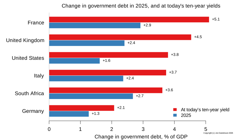
Had the whole US debt paid the ten-year yield in 2025, the interest bill would have been 5.8% of GDP, not 4.0%, and the debt ratio would have risen by 3.5 percentage points, not 1.6.
In France the interest bill would have been 2.2% of GDP higher, and the debt ratio would have risen by more than 5 points. In the UK the bill would have been 1.5% of GDP higher. That comes on top of the deficits they already run.
And France now pays the same as Italy to borrow for ten years, and more than Greece.
Japan's interest bill would have risen the most, by 4.7% of GDP, and its debt ratio would still have fallen, by about 3 points, as would Greece's.
Inflation matters here. The what-if sets a nominal yield against the nominal growth of 2025, when the GDP deflator rose by 2.9% in the US and 3.4% in Japan. With the deflator at 2%, the US debt ratio would have risen by 4.5 points, not 3.5, and Japan's would have been almost flat.
How fast the higher interest bill arrives depends on the maturity of the debt. It is just under six years on average in the US and over thirteen in the UK, as the chart in The next crisis shows. The UK's long maturity protects it less than it looks, since a quarter of its debt is index-linked and the Bank of England's bond purchases have shortened the effective maturity.
Suppose a government with an average maturity of six years refinances a sixth of its debt every year. The fourth table applies the same rule to each country. It shows the annual increment to the interest bill that the rule implies, if yields stay where they are.
| Average maturity, years | Extra interest at the ten-year yield | Illustrative annual increment | |
|---|---|---|---|
| United States | 5.9 | 1.9% | 0.3% |
| United Kingdom | 13.5 | 1.5% | 0.1% |
| France | 8.5 | 2.2% | 0.3% |
| Italy | 7.9 | 1.4% | 0.2% |
| Germany | 8.7 | 0.8% | 0.1% |
| Spain | 8.1 | 1.1% | 0.1% |
| Greece | 18.4 | 2.5% | 0.1% |
| Japan | 9.4 | 4.7% | 0.5% |
It is a rough calculation. The US would add about 0.3% of GDP a year to its interest bill, France about 0.3%, Japan about 0.5% and the UK about 0.1%. Actual redemption schedules are lumpier than that.
Technical details
For France, Italy, Germany, Spain, the Netherlands and Greece, debt, the balance, interest paid and GDP in 2025 are the official figures Eurostat published in April 2026. They differ a little from the IMF estimates in the chart in The next crisis, which came out before them.
The sources follow a fixed order, and a lower one is never used when a higher one is available. EU members come from Eurostat alone. For the US, the UK and Japan, debt and the overall balance are from the IMF Fiscal Monitor, nominal GDP is from the World Bank and interest paid is gross general government interest from the OECD Economic Outlook 119. The primary balance is the overall balance plus that interest, the European Commission's convention, so it differs from the IMF's own primary balance, which adds back net interest. These rows combine three sources, so they are estimates in a way the euro area rows are not.
The first two tables follow the layout and the signs of the country tables in the Commission's Debt Sustainability Monitor: the primary balance as a balance, interest expenditure positive, and the growth and inflation effects negative. The Commission's own decomposition for 2025, made before the outturn, has the same signs and similar sizes. For France it has a primary balance of −3.2, a snowball effect of −0.1 and a change in the ratio of 3.1, against −2.9, 0.0 and 2.9 here. The IMF presents the same arithmetic differently, with a primary deficit and the snowball split into the real interest rate and real growth.
The OECD's figure for the US is the BEA's, which includes interest imputed on unfunded government pension liabilities, 0.8% of GDP in 2024, the latest year published. The IMF's debt excludes those liabilities, so that interest is taken off, with the 2024 share carried forward to 2025 as an estimate.
For Iceland and South Africa the interest bill is the IMF's net interest. The OECD series has no gross interest figure for South Africa, and Iceland's is on a much wider debt base than the IMF's, 82% of GDP against 56%. Both are left out of the third table, because comparing a net bill with a gross bill at today's yield would overstate the rise. Iceland also has no current ten-year yield in the sources used.
The interest bill divided by the debt a year earlier, with both in money terms, gives the effective rate, 3.4% for the US, 3.4% for the UK, 2.0% for France, 2.9% for Italy, 1.8% for Germany and 2.1% for Greece. The snowball is the effective rate minus the growth of nominal GDP, times the debt ratio a year earlier, divided by one plus growth. Nominal rates with nominal growth and real rates with real growth give the same snowball, provided both are deflated by the GDP deflator. With the nominal effective rate, nominal growth, the real rate and real growth, the exact relation is
$$ \frac{i - n}{1 + n} = \frac{r - q}{1 + q} $$
Equality of the plain differences is an approximation. The split into real growth and inflation is an accounting one. It puts their interaction in the inflation term, and it does not say what inflation does once interest rates, budgets and activity respond.
Real growth is from Eurostat's chain-linked volumes for the euro area countries and from the IMF World Economic Outlook for the others. Inflation is the GDP deflator implied by nominal and real growth, so interest, real growth and inflation add up to the snowball. The what-if with the GDP deflator at 2% keeps the nominal yield, real growth and the opening debt as they were, and the primary balance and the stock-flow adjustment as they were as shares of GDP.
The change in debt is the change in the debt ratio from 2024 to 2025. The stock-flow adjustment is what is left after the primary balance and the snowball effect. For the six euro area countries it matches the stock-flow adjustment Eurostat publishes to within 0.1, and their effective rates are within 0.2 of Eurostat's apparent cost of debt. It is large for Italy, where building tax credits add to debt years after they were recorded in the deficit, and also for Spain and the UK. Rows may not add up because of rounding.
Ten-year yields are August 2026 averages, from the ECB for the six euro area countries and from FRED for the UK and Japan, and the 16 September 2026 close for the US.
In the third table, the interest bill at the ten-year yield is that yield times the debt ratio a year earlier, divided by one plus growth. So it is 2025 with only the interest rate changed. The change in debt at the ten-year yield is the actual change plus the extra interest. This assumes the whole opening debt stock paid the selected ten-year yield throughout 2025. Actual costs depend on the terms and the refinancing date of each liability, and Greece's long official loans make the assumption particularly distant from how it is actually financed. The ten-year yield is also one benchmark for every country, and it ignores how each one borrows. A government with a lot of short debt refinances part of it below the ten-year yield. On 16 September the US curve ran from 4.45% at one year to 4.86% at five and 5.01% at ten. At the yield for its own average maturity, 4.90%, the US figure would be 3.4 points and not 3.5.
The fourth table divides the extra interest in the third table by the average maturity of the debt. It takes the share refinanced each year to be one over the average maturity, the rule of thumb in the IMF Fiscal Monitor, which divides debt by average maturity to get the average annual repayment, and it supposes that yields stay where they are. Applying that share to the extra interest is my extension of the rule, not an IMF estimate. The same average maturity fits very different redemption schedules, so it is an illustration and not a timetable. Eurostat's data show more falling due in the first year than the rule assumes, 19% of Italian debt against 13%, which would make Italy's increment 0.3 and not 0.2. For the euro area countries the maturity is Eurostat's average remaining maturity of general government debt, which is why Germany and Greece differ from the chart in The next crisis. For the US, the UK and Japan it is the OECD's figure for central government marketable debt, from its Global Debt Report 2026. Eurostat publishes none for the Netherlands.
The country tables in the European Commission's Debt Sustainability Monitor 2025. Each has the rows Gross debt ratio, Change in the ratio (−1+2+3), (1) Primary balance, (2) Snowball effect, with (2.1) Interest expenditure, (2.2) Growth effect (real) and (2.3) Inflation effect, and (3) Stock-flow adjustments. The full report is a PDF, and the table for Belgium is on page 124.